Experience Design
Technology & Development Services
Design & Branding
Digital Marketing, SEO
Powerful, Intuitive, and Scalable Admin Dashboard Design
Turn complex data into clear, actionable insight for the people who run your business.
We design admin dashboards that streamline workflows, boost productivity, and surface real-time insight from your data — tailored specifically to how your operations actually work, not a generic analytics template. Every dashboard is built to transform complex data into simple, strategic action points for the people using it every day.


Real-Time Data Insight
Instant visibility into the metrics and performance indicators that actually matter to your operations.

Built for the Actual Users
Interfaces designed around the daily tasks of the people using the dashboard, not a generic admin template.

Scales With Your Business
Flexible, modular designs built on modern frameworks that grow alongside your operational needs.
What Is Admin Dashboard Design?
Admin dashboard design is the process of turning complex operational data into a clear, usable interface for the people who manage your business day to day. It covers information architecture, data visualization, and interaction design — structured specifically around your workflows rather than a generic analytics template. Organizations invest in dedicated dashboard design to drive operational excellence, cut manual processes, and turn raw data into strategic decisions.
Get a Dashboard Design ProposalIn-Depth Research & Strategy
We define the dashboard's purpose, key metrics, and user needs through direct research, not assumptions.
Information Architecture & Wireframing
Navigation, data hierarchy, and low-fidelity wireframes establish the structure before any visual design begins.
UX Prototyping & Feedback
A clickable, mid-fidelity prototype validates the experience before we invest in final visual design.
Final UI Creation
Pixel-perfect visual design applies your brand guidelines and turns raw data into clear, engaging charts and graphs.
Design Hand-off & Delivery
A complete asset package, style guide, and technical consultation ensure a seamless handover to your development team.
Dashboards Built Around Your Real Workflows
A dashboard only works if the people using it every day can actually navigate it fast. Every design decision starts with your specific operational needs, not a generic template.
Get a Dashboard Design ProposalAnalytics & BI Dashboards
Custom business intelligence tools that visualize performance and support decisions at scale.
Operational Admin Panels
Internal tools that streamline day-to-day tasks and reduce manual, repetitive processes.
Customer & Data Management Dashboards
Centralized interfaces for managing customer records, orders, or operational data securely and efficiently.

Why it matters
A poorly designed dashboard doesn't just look outdated — it slows down every team that depends on it, buries the metrics that matter, and increases the chance of costly manual errors. A well-designed one becomes a genuine operational advantage.
Accelerate your Business
Success, just like our clients
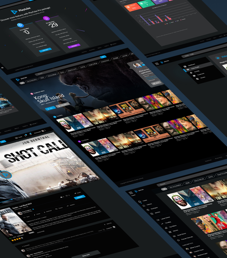
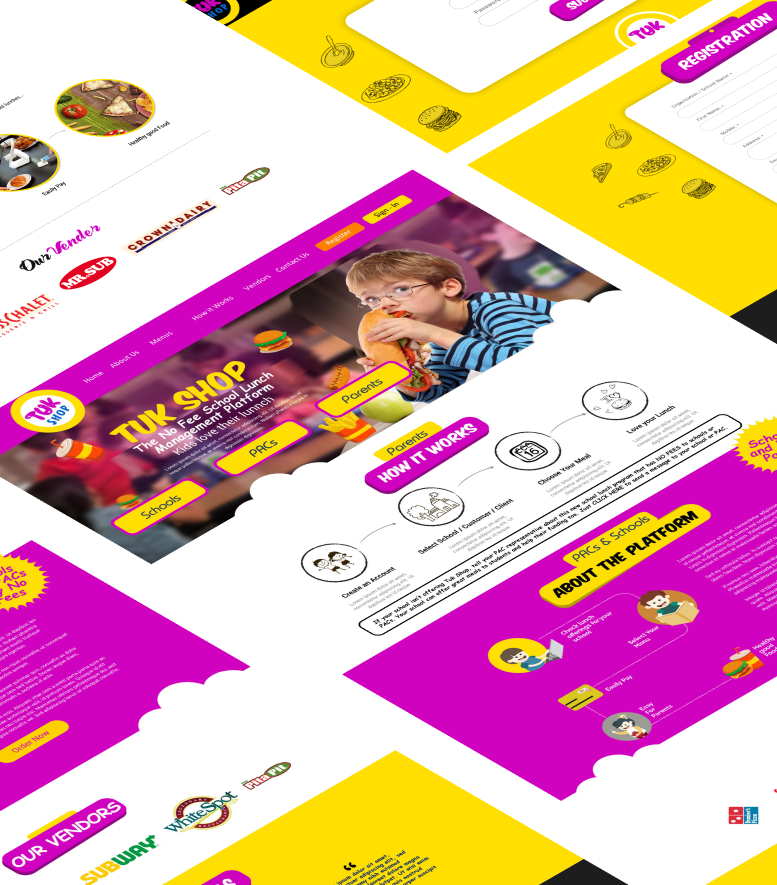
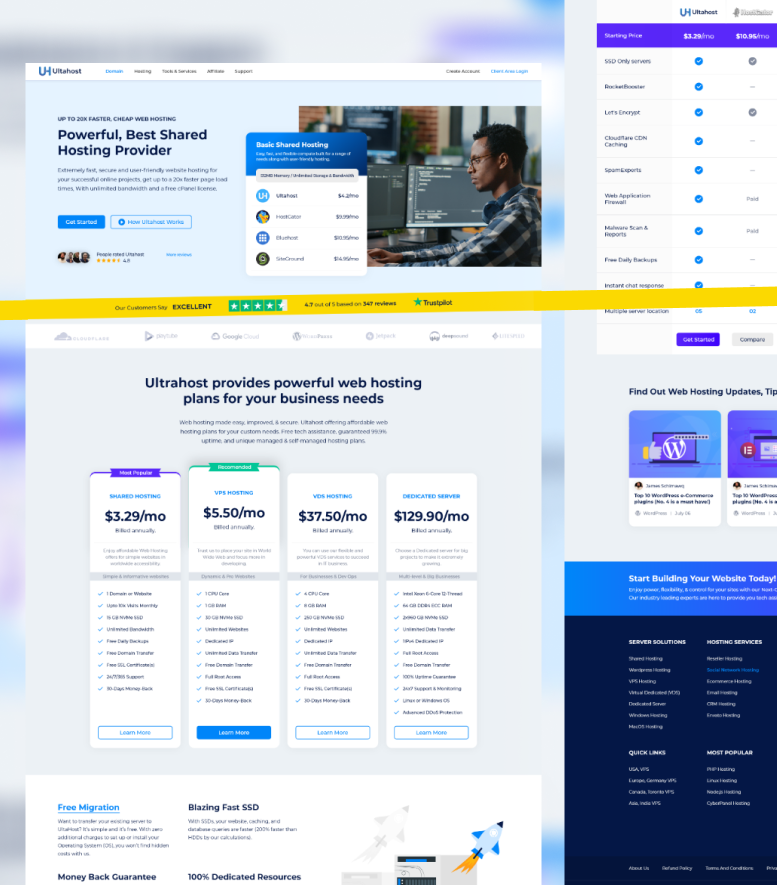
Our Proven Dashboard Design Process
An agile, collaborative, results-driven process transforms complex data into an intuitive, high-performance administrative tool.
Every stage ensures the final dashboard aligns with your actual business goals and operational needs, not a generic template.
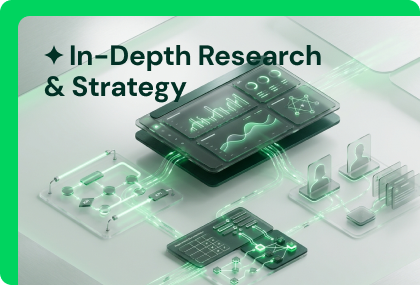
In-Depth Research & Strategy
We define the dashboard's purpose, key metrics, and user needs through direct research and stakeholder interviews.
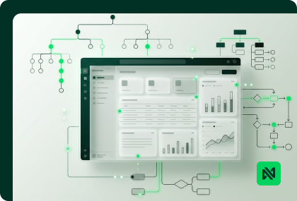
Information Architecture & Wireframing
We structure navigation and data hierarchy, then build low-fidelity wireframes to visualize the layout before any visual design.
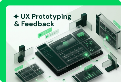
UX Prototyping & Feedback
A clickable, mid-fidelity prototype lets us validate the experience with your team before visual design investment begins.
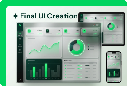
Final UI Creation
Pixel-perfect visual design applies your brand guidelines and turns raw data into clear, engaging charts and graphs.
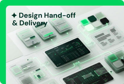
Design Hand-off & Delivery
A complete package of design assets, component libraries, and a style guide ensures a seamless handover to development.
Admin Dashboard Design Expertise
From information architecture to data visualization, our dashboard design expertise covers every layer needed to turn complex data into a genuinely usable tool.
User-Centric UX Design
Easy-to-navigate interfaces optimized for the efficiency of the people actually using the dashboard daily.
Data Visualization & Analytics
Clear, interactive charts and graphs that make complex data instantly understandable, not just decorative.
Custom Dashboard Development
Solutions built specifically for your business processes, not adapted from a generic admin template.
Responsive & Adaptive Layouts
Dashboards accessible and fully usable from any device, so operations don't stop when someone steps away from a desk.
Performance Optimization
Smooth, high-speed dashboards built for quick access even with high-volume data.
Security & Compliance
Dashboards designed with data protection built in, aligned to the regulatory standards your industry requires.
Why Nexovah for Admin Dashboard Design?
A design partner who treats your dashboard as operational infrastructure, not a cosmetic reporting screen — backed by a 4.6/5 average client trust score.
Workflow-First Design
Every dashboard is structured around your actual operational workflows, not a generic template.
Clear Data Visualization
Complex data turned into charts and views your team can actually act on quickly.
4.6/5 Trust Score
A consistent track record of client satisfaction across Google, Trustpilot, and Clutch.
Full Dev Hand-off
Complete design assets, component libraries, and a style guide delivered for a seamless build.
Free Setup Support
First-time domain, hosting, and server configuration support included at no extra cost.
Tools and
technologies we use
We leverage the latest design and development tools to craft stunning user experiences with exceptional functionality.
Design Tools
 Figma
Figma Adobe Illustrator
 Adobe Photoshop
 Canva
CanvaDevelopment
 React
React Node.js
 HTML5
HTML5 CSS3
CSS3Trusted by 350+ businesses








4.6 Stars, 10 Reviews
4.6 Stars, 50+ Reviews

75+ Projects Repository

4.5 Stars, 32 Reviews

4.4 Stars, 40 Reviews

4.7 Stars, 550 Reviews
4.8 Stars, 07 Reviews

4.8 Stars, 371 Reviews

4.6 Stars, 05 Reviews

Don't take our word for it
Verified Everywhere. Trusted, reviewed, and recommended across the platforms that matter. We are open for a project — lets discuss.
Learn more


The tools behind the work
The tools are not the advantage. The advantage is knowing which tool owns which job — and wiring them together so the output is faster, cleaner, and more consistent than any single tool could deliver alone.
Frequently Asked Questions
Dashboard design centers on data density, information hierarchy, and workflow efficiency for a smaller, expert user base — rather than persuading a broad public audience like a marketing website does.
Yes — we regularly redesign existing dashboards, starting with research into current pain points and workflows before proposing structural or visual changes.
We deliver the full design package — wireframes, prototypes, and final UI — plus a complete developer hand-off. We can also build the frontend if you need full-stack delivery.
Through deliberate information architecture and data visualization choices — clear charts, sensible hierarchy, and performance optimization so the dashboard stays fast even at scale.
Yes — responsive and adaptive layouts are a standard part of our dashboard design process, so the dashboard stays usable from any device.
We value your privacy
We use cookies (including Google Analytics) to understand how visitors use our site and improve your experience. Read our Privacy Policy for details.