Experience Design
Technology & Development Services
Design & Branding
Digital Marketing, SEO
Brand Identity Design That Builds Trust Before You Say a Word
Logo, typography, color, and a style guide that keeps every touchpoint consistent
Your brand is the impression customers form before they read a single word of copy. We build complete brand identity systems — logo and variants, typography, color palette, supporting graphics, and a documented style guide — so every touchpoint, digital or print, looks and feels like the same company.

Full Identity System
Logo, typography, color palette, and supporting graphics designed as one cohesive system, not disconnected assets.

Strategy Before Design
Brand positioning and competitor research inform every visual decision, not just aesthetic preference.

Documented Style Guide
A clear brand book so every future designer, agency, or internal hire applies your identity consistently.
Why Brand Identity Is More Than a Logo
A logo alone can't carry consistent brand recognition across a website, packaging, social media, and print collateral. It takes a full system — typography, color, imagery style, and clear usage rules — to make your brand instantly recognizable everywhere it appears.
Talk to Our TeamLogo Design & Variants
A versatile core logo and its variants, designed to work across web, mobile, social, and print applications.
Typography & Color System
Primary typefaces and a strategic color palette — including light and dark theme options — chosen to match your brand's tone.
Supporting Graphics
Icons, imagery style, and social media templates extending your visual language beyond the logo.
Brand Guidelines
A documented style guide detailing exactly how your logo, colors, and typography should be used consistently.
Marketing & Print Collateral
Brochures, business cards, pitch decks, and other assets built to match your digital brand identity.
Design Tools Behind Every Brand Identity System
From initial concept sketches to production-ready files, we work in the tools that keep your brand assets clean, editable, and ready for any application.
Get a Free QuoteConcept & Layout
Figma for collaborative design exploration and precise, scalable brand systems — every logo, color swatch, and component lives in one file your team and ours can reference, iterate on, and hand off cleanly.
Vector & Print Production
Adobe Illustrator for logo marks and print-ready vector assets — every logo built as true vector artwork, not a raster export, so it scales from a favicon to a building sign without ever looking soft or pixelated.
Imagery & Social Assets
Adobe Photoshop and Canva for supporting graphics, photo treatment, and social media templates — so your team can produce on-brand posts and marketing assets long after the core identity ships, without needing a designer for every single one.
Typography & Font Licensing
We select and properly license every typeface in your system — Google Fonts, Adobe Fonts, or custom foundry licenses — so your brand's type choices are legally covered for commercial use across web, app, and print, not a font pulled from an unlicensed source.
Brand Documentation & Style Guides
Every identity ships with a documented brand guide — logo usage and clear-space rules, the full color palette with exact values, typography specs, and do's-and-don'ts examples — a living reference your team and vendors can follow without calling us for every decision.
Motion & Digital Brand Assets
Logo animation, favicon sets, app icons, and social media profile kits — the digital-native assets a modern brand needs beyond print, built and exported in every size and format the platforms actually require.

Why Consistency Builds Trust Faster Than Novelty
Customers trust brands they recognize instantly. A documented style guide is what keeps your identity consistent across every team, vendor, and campaign — not just the initial launch.
Accelerate your Business
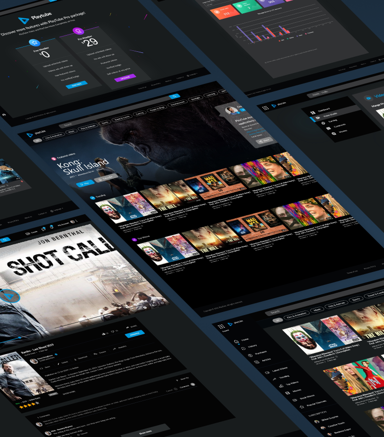
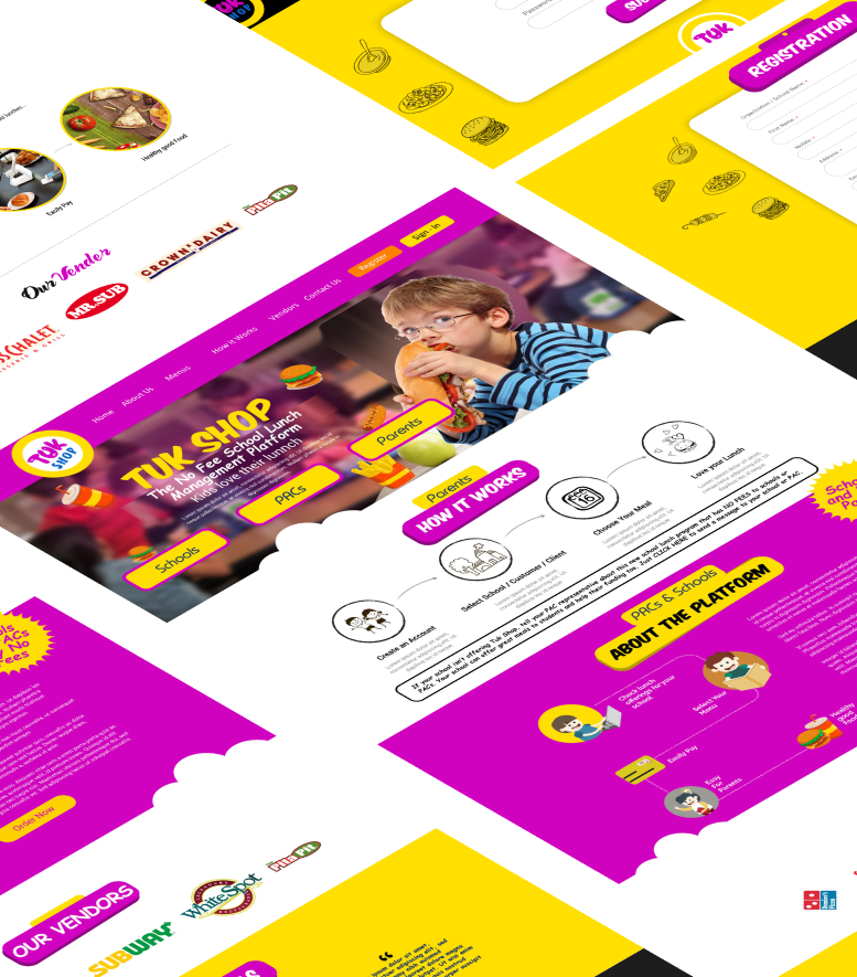
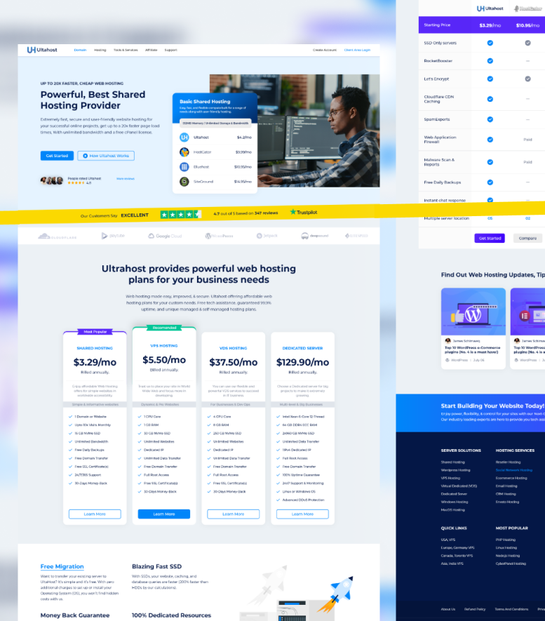
Success, just like our clients
Our Brand Identity Design Process
A memorable identity comes from research, not guesswork — we study your market and competitors before a single concept gets sketched.
Six stages from brand discovery to a finished style guide your team can apply consistently.
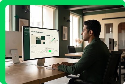
Brand Discovery & Audit
A deep-dive into your brand's purpose, unique value proposition, and existing assets, alongside competitor research.
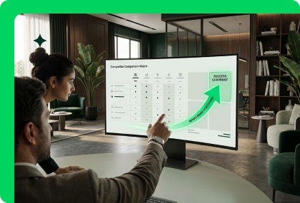
Market Research & Positioning
Consumer and competitive research shaping a grounded, strategic direction for the identity before any design starts.
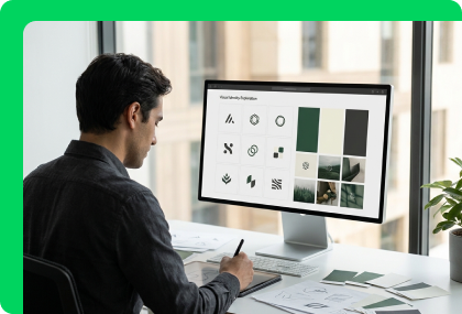
Ideation & Visual Exploration
Multiple visual directions, tone explorations, and mood boards presented for your feedback before committing to one path.
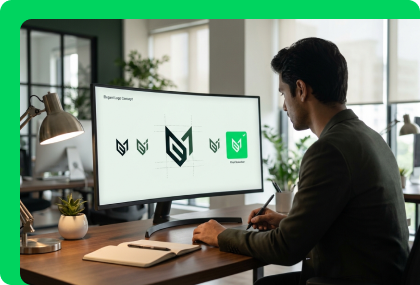
Logo Concept & Development
The core logo and its variants designed and refined collaboratively based on your feedback.
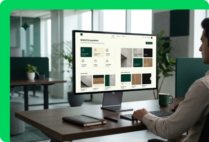
Systemization & Supporting Graphics
Extending the visual language with icons, imagery, and social templates versatile enough for any future creative project.
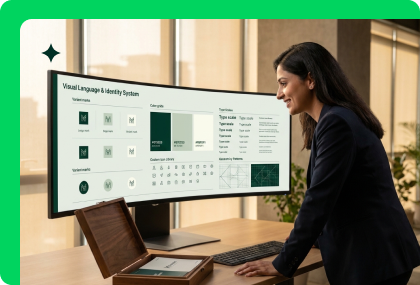
Finalization & Style Guide
A comprehensive Brand Style Guide detailing consistent usage across every platform and application.
Brand Identity Expertise Across Industries and Scale
From early-stage startups defining their first identity to established companies refreshing a dated one, we adapt the process to where your brand actually is.
Logo Design & Identity Marks
A logo isn't a single file — it's a mark engineered to work as a full-color primary version, a simplified icon for app tiles and favicons, a single-color version for engraving or embroidery, and a reversed version for dark backgrounds, all while staying legible at 16 pixels and readable at billboard scale. We design primary marks, secondary lockups, and icon-only variants together from the start, not as an afterthought once the main logo ships, so nothing breaks the first time you need it on a different surface. Every logo we deliver comes with the minimum-size rules and clear-space requirements that keep it looking intentional wherever it lands — a business card, an app icon, or a conference backdrop.
Color Systems & Palette Strategy
Color is the fastest signal a brand sends, recognized before a single word is read — which is why we build a full palette, not just a primary color: a core brand color, supporting secondary tones, and a set of neutral and accent colors with defined use cases for each, so your team never has to guess which shade is "the" brand color. Every color ships with exact values across the formats you'll actually need — HEX for web and digital, CMYK for print, Pantone where color-matching precision matters — plus documented accessibility contrast ratios, so your brand looks right and reads clearly for every user. Get this wrong and every touchpoint looks slightly off; get it right and your brand becomes instantly recognizable in a feed, on a shelf, from across a room.
Typography & Visual Language
Typography carries as much of a brand's personality as its logo does — the same words set in a different typeface read as playful, authoritative, minimal, or premium before anyone processes what they actually say. We pair a primary display typeface for headlines with a complementary body font built for real readability across print and screen, then document the full type scale — weights, sizes, spacing — so a headline on your website and a headline in your pitch deck clearly belong to the same brand. For companies that need genuine differentiation, we also scope custom or properly licensed display fonts competitors can't simply pull off a free font site.
Brand Design Systems
A logo and a color palette aren't a brand system — they're ingredients. We assemble them into a documented design system: reusable components, spacing rules, iconography style, and photography direction that carry your identity consistently from your website into your product, your pitch deck, and every asset a vendor or new hire touches after we're gone. This is the layer that stops a growing team from quietly drifting off-brand months after launch, because the rules — and the reusable files — are already built and handed to whoever needs them next. For product and SaaS companies, we extend this system directly into UI component libraries, so brand identity and product design speak the same visual language.
Startup Brand Systems
Early-stage companies need a brand that reads as credible to investors and customers from day one, without the six-month timeline a legacy agency brings to an enterprise rebrand. We run a fast, focused identity process — strategy, logo, color, typography, and a lean but genuinely usable style guide — scoped to launch a cohesive brand presence in weeks, so you're not choosing between moving fast and looking established.
Enterprise Rebrands
Refreshing an established brand is a different problem than building one from nothing — you're migrating years of equity, existing collateral, and internal habits without alienating customers who already recognize you. We run a structured rollout: auditing every existing touchpoint, sequencing the transition so nothing launches half-updated, and documenting the new system thoroughly enough that marketing, sales, and product teams execute consistently from day one instead of improvising for the next year.
Why Businesses Choose Nexovah for Brand Identity
We align every design decision with brand strategy, not just visual taste, so your identity does more than look good — it communicates clearly and consistently.
Strategy-Led Design
Market and competitor research inform every visual decision before concepts are sketched.
Complete Identity Systems
Logo, typography, color, and supporting graphics delivered as one cohesive system.
Documented Style Guides
Clear usage rules so consistency holds across every future team, vendor, or campaign.
Digital & Print Cohesion
Brand identity applied consistently across websites, apps, and physical collateral alike.
Flexible for Any Stage
Identity packages suited to startups, SMEs, and large enterprises alike.
Tools and
technologies we use
We leverage the latest design and development tools to craft stunning user experiences with exceptional functionality.
Design Tools
 Figma
Figma Adobe Illustrator
 Adobe Photoshop
 Canva
CanvaTrusted by 350+ businesses








4.6 Stars, 10 Reviews
4.6 Stars, 50+ Reviews

75+ Projects Repository

4.5 Stars, 32 Reviews

4.4 Stars, 40 Reviews

4.7 Stars, 550 Reviews
4.8 Stars, 07 Reviews

4.8 Stars, 371 Reviews

4.6 Stars, 05 Reviews

Don't take our word for it
Verified Everywhere. Trusted, reviewed, and recommended across the platforms that matter. We are open for a project — lets discuss.
Learn more


The tools behind the work
The tools are not the advantage. The advantage is knowing which tool owns which job — and wiring them together so the output is faster, cleaner, and more consistent than any single tool could deliver alone.
Brand Identity — Frequently Asked Questions
Brand identity is the complete visual and verbal system that communicates your brand's values — logo, typography, and color palette. It creates a recognizable, consistent representation of your company that directly shapes customer perception and trust.
Your logo and its marks, chosen typography and usage rules, primary and secondary color palettes, and supporting graphics like icons and imagery style — all documented together in a brand style guide.
Brand identity defines the core visual rules — logo, colors, typography. Website design (UI/UX) applies those rules to a functional digital product. We handle both, ensuring seamless integration between the two.
A finalized logo and its variants, brand tone and voice guidelines, a defined visual system (typography, color, iconography), and a comprehensive style guide for consistent use across every channel.
Yes — we conduct market, audience, and competitor research and define brand positioning and tone of voice before any design work starts, ensuring the visuals are grounded in strategy.
Business stationery, presentation and pitch deck design, marketing materials like brochures and flyers, social media templates, and product packaging design where required.
We value your privacy
We use cookies (including Google Analytics) to understand how visitors use our site and improve your experience. Read our Privacy Policy for details.